


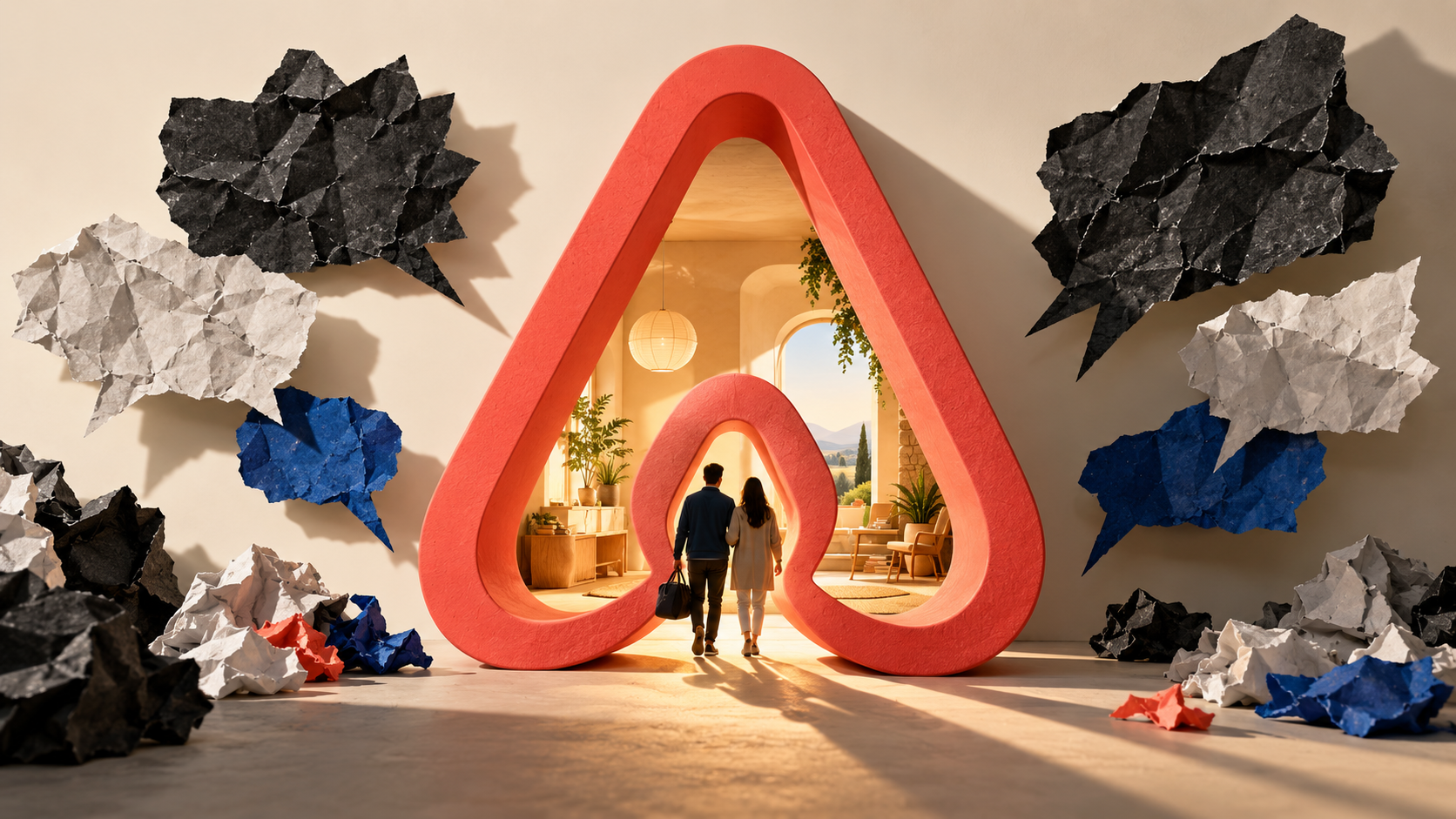
The Airbnb rebrand of 2014 worked as strategy and bombed as a launch. The new Belo symbol became a meme within hours, while the idea behind it, Belong Anywhere, went on to shape the company for a decade. The logo was never the point. Airbnb had a story strong enough to survive a terrible first week.
Here is what the company got right, what it got wrong, and what to copy the next time you change your own brand.
Key Points
Belong Anywhere: Worked. The idea gave Airbnb a reason to exist beyond offering cheap rooms.
The Belo symbol: Bombed at launch, but survived. The logo was mocked as resembling body parts within hours of its reveal, yet became an enduring brand asset.
The rollout: Bombed. The launch lacked a stress test of how the internet would interpret the new symbol.
Holding the line: Worked. Airbnb stood behind the rebrand, and the mark is now recognized worldwide.
What Was the Airbnb Rebrand?
The Airbnb rebrand was a full identity change launched in July 2014, built by the London agency DesignStudio. It replaced a blue script wordmark with a clean sans-serif name and a new symbol called the Belo. The strategy behind it was a single phrase: Belong Anywhere.
This was not a logo refresh with a new color. Airbnb changed what it sold. The old brand said cheap places to sleep. The new one said you can feel at home in a city you have never visited.
That shift mattered because the old positioning had a ceiling. Cheap is a claim any competitor can copy by lowering a price, and it puts you in a fight you have to win again every quarter. Belonging is a claim a hotel chain cannot make honestly, which is exactly why it was worth building on.
What the Belo Was Supposed to Mean
The Belo was designed to read four ways at once: a person, a place, a heart, and the letter A. It was drawn to be simple enough for a host to draw by hand and paint on a door.
That flexibility was the real design brief. Airbnb needed a mark that worked as an app icon, a sticker, a doormat, and a tattoo, long before most brands were thinking that way.
Most logos are drawn for a business card and then forced onto a phone screen. This one was drawn the other way around, which is why it still looks correct at sixteen pixels.
Where Belong Anywhere Came From
Belong Anywhere came out of research with hosts and guests, not out of a design studio. The company found that the thing people valued was not the price. It was feeling like a local instead of a tourist.
A slogan decorates the marketing. A brand purpose tells you which products to build and which ones to kill. Belong Anywhere was the second kind.
Why Did People Hate the Belo Logo?
People hated the Belo logo because a simple abstract shape can look like almost anything, and the internet found the worst reading in about an hour. DesignStudio co-founder Paul Stafford later said you only need to search "Airbnb logo meme" to see every version, from body parts to bathroom signs.
The Jokes Ate the First Week
The jokes did more than sting. They ate the first week of coverage. Logos need roughly five to seven exposures before they register with a normal person, and Airbnb burned most of those early exposures on a punchline.
Nobody Outside the Room Saw It Cold
The mistake was not the shape. It was that nobody outside the project ever looked at it cold. Everyone in the room already knew it meant people, places, love, and Airbnb, so nobody could see it the way a stranger would.
Show the design to people who owe you nothing, and ask them what it looks like before you ask them if they like it. Twenty honest strangers will find every bad reading in an afternoon, which is cheap compared to a launch week spent apologizing.
What Did the Airbnb Rebrand Get Right?
The Airbnb rebrand got the order of operations right. It started with what customers actually wanted, then built the identity to carry that idea, instead of picking a look and writing a story to match it later.
They Talked to Hosts Before They Drew Anything
The team spent months with hosts and guests before anyone picked a typeface. That is why the idea survived. A strategy built from what people told you is much harder to argue with than one built from what a founder likes.
It Got Airbnb Out of a Price Fight With Hotels
Before 2014, Airbnb competed with hotels on price and lost that fight on trust. Belonging moved the comparison somewhere hotels could not follow, which is the whole job of positioning.
What Still Holds Up a Decade Later
A decade on, these are the parts that still hold:
- The idea outlasted the design fight. Belonging still explains why Airbnb builds what it builds
- It moved the company out of a price war with hotels and into a category of its own
- The mark scaled everywhere, from a phone icon to a painted door, which is rare
- It gave hosts something to belong to, not just a platform to list on
Ten years later the Belo reads as familiar and reassuring rather than strange. That is what consistency buys. The same move shows up in every good adaptive branding story, where the company changes what it offers without changing what it stands for.
Repetition is the cheapest brand asset there is, and almost nobody uses it. Companies swap logos every few years chasing a fresh look, then wonder why nothing sticks in a buyer head. Airbnb kept one mark through a decade of growth and got recognition for free.
What Did Airbnb Get Wrong?
Airbnb got the launch wrong, not the strategy. The company treated the reveal as a design announcement when the internet was always going to treat it as raw material for jokes.
They Led With the Logo Instead of the Reason
The reveal led with a new mark and explained the thinking afterward. That order hands the narrative to whoever comments fastest, and the fastest comment is always a joke.
The Same Slip-Ups Happen Everywhere
Most companies make the same three:
- The design was tested inside the building, where everyone already knew what it was supposed to mean
- Nobody drew the parody versions first, which takes an afternoon and saves a quarter
- The story got explained after the mark landed instead of arriving with it
You can see the cost in the coverage. The strategy was strong and nobody was talking about it, because a shape was doing all the talking. Your brand is not your logo, but on launch day your logo is the only part anyone can see.
The fix is not a safer design. A mark bland enough to be joke-proof is also forgettable, which costs more over ten years than a bad week costs in one. The fix is knowing which jokes are coming and having your answer ready.
What Should You Copy From the Airbnb Rebrand?
Copy the research and the nerve, not the symbol. Airbnb won because it knew what its customers were really buying and refused to flinch when the first week went badly.
How to Run Your Own Rebrand
Here is what to do instead:
- Start with customer interviews, not a mood board
- Write the sentence your brand stands for before anyone draws anything
- Show the design to strangers and ask what it looks like, not whether they like it
- Launch the story and the look on the same day, in that order
- Give it a year before you judge it, and do not redesign in a panic
That last rule is the one most companies break. A rebrand that gets pulled after three bad weeks costs you twice, once for the work and once for the confusion. A clear brand story is what gives a leadership team the confidence to hold the line while the noise dies down.
Ask yourself one question before you launch: if this gets mocked on day one, do we still believe the strategy on day ninety? If the answer is yes, ship it and hold. If the answer is no, the design was never the problem.
Airbnb Is Still Using the Same Idea
Airbnb is still running the same play. In May 2025 it relaunched Experiences and added Services under the line "Now you can Airbnb more than an Airbnb," expanding the business off the same belonging idea it locked in eleven years earlier.
The same thinking drove Icons in 2024, the run of stunt stays that included the house from the movie Up. That run pulled more than 10,500 media stories and 15 million page views. None of that works without the belonging idea sitting underneath it. A company that only had a logo would have had nothing to extend.
Rebrand on Strategy, Not on a Whim
The Airbnb rebrand is worth studying because the ugly part and the smart part happened at the same time. The symbol was mocked, the strategy was sound, and the strategy is what survived. If you take one thing from it, take this: a rebrand fails when there is no idea underneath it, not when the internet makes a joke.
Ask what your company would stand for if you kept every product exactly as it is and changed nothing but the story. If you cannot answer that in one sentence, a new logo will not help you, and a rough launch week will feel like proof you were wrong.
Most rebrands we get called into start with a logo request and end somewhere else entirely, because the real problem was never the look. Our Brand Story Development engagement does the research first, settles what you actually stand for, and only then decides what should change. Bring us the rebrand you have been arguing about and let us find out whether you need one.
Sources
- Creative Review, DesignStudio's Airbnb Rebrand: 10 Years On
- Fortune, Airbnb's New App Launch
- Axios, Airbnb's Icons Is Its Latest Communications Bet
- McKinsey and Company, Branding


