


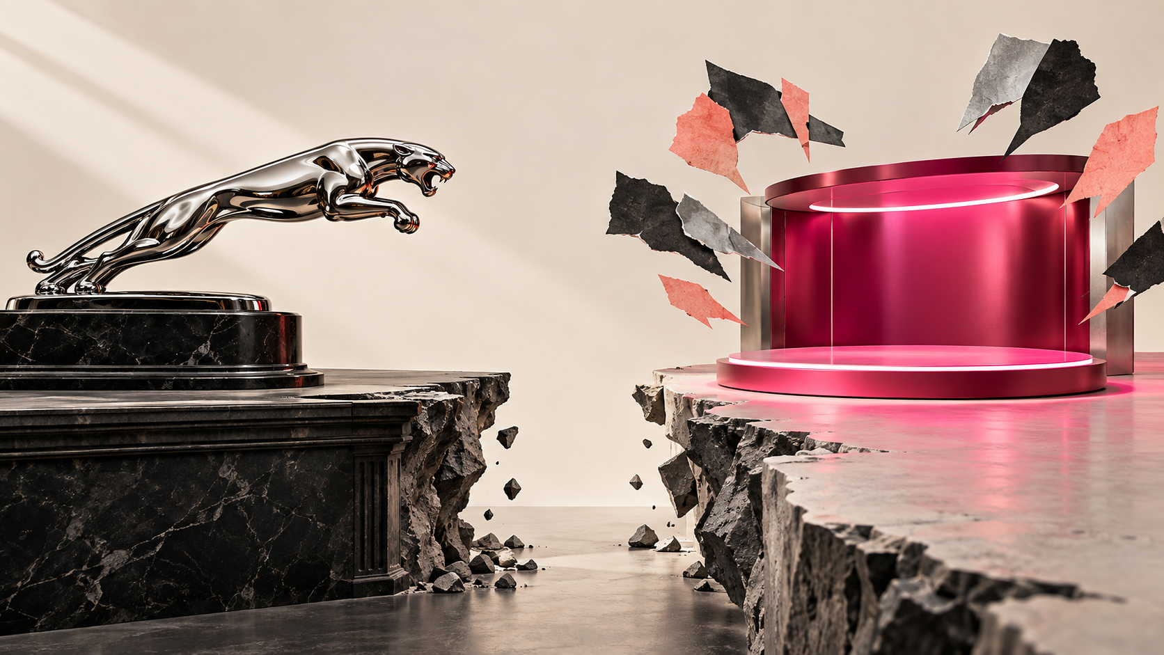
A 90-year-old British car brand ran an ad with no cars, painted a concept car pink, and got roasted by the entire internet. Easy story, easy laughs. But the true read is - Jaguar knew exactly what it was doing, made a defensible bet, and then broke the one rule that makes a bet like this pay off.
Let me walk you through it as one operator to another, because there is a real lesson buried under all the mockery, and it will cost you money if you miss it.
What did Jaguar actually change in its rebrand?
In November 2024, Jaguar did not tweak a logo. It detonated its own identity on purpose. This was a full teardown, not a refresh.
Here is what changed, in plain terms:
Wordmark: The classic serif “JAGUAR” was replaced with a typographic mark styled as “JaGUar,” mixing uppercase and lowercase letters.
The Leaper: The prominent leaping cat, carrying decades of brand recognition, was reworked and moved into the background rather than leading the identity.
Campaign: Cars, speed, and British performance gave way to “Copy Nothing,” a launch campaign featuring no cars.
Tone: Heritage luxury shifted to bright, avant-garde fashion, supported by messages like “Delete Ordinary” and “Live Vivid.”
The launch film was the part that broke the internet. No vehicles. Just models in loud, colorful, art-gallery outfits, set against slogans like "Copy Nothing" and "Delete Ordinary." For a car company, showing zero cars was a genuine shock.
A few weeks later, at Miami Art Week in December 2024, Jaguar revealed the payoff: the Type 00 concept, a long, angular electric grand tourer with butterfly doors. It came in two colorways, London Blue and a hard-to-ignore Miami Pink. The pink one is the image everyone remembers, and that was not an accident.
Why did people hate the Jaguar rebrand so much?
Because Jaguar led with vibes and made the audience wait for the substance. When you do that, people fill the silence with their own conclusions, and the conclusions were not kind.
The backlash had a few distinct layers, and it helps to separate them:
- The "where are the cars" problem. Elon Musk replied to the campaign with four words: "Do you sell cars?" That post pulled far more engagement than the ad itself. When your loudest critic gets to write your headline, you have already lost the framing.
- The culture-war pile-on. The colorful, fashion-forward casting got swept into a "go woke, go broke" narrative online. Fair or not, Jaguar handed critics an easy target and then answered defiance with more defiance, which only fed the fire.
- The heritage grief. Longtime Jaguar people watched the leaping cat and the classic wordmark get shelved. That cat was not just a logo. It was decades of accumulated meaning, and stripping it felt like a brand disowning its own family.
- The confusion tax. Most people genuinely could not tell what Jaguar was now. Luxury? Art? Fashion? Fewer cars? This is the expensive one, and I will come back to it.
The campaign got seen. It got talked about by people who had not thought about Jaguar in years. Attention is not the same as approval, but it is not nothing either. So the real question is not whether people hated it. They did. The question is whether the hate meant Jaguar was wrong.
Was the Jaguar rebrand actually a mistake?
This is where I split from the pile-on, because a bold, polarizing move is not automatically a bad one. I respect a big swing. What matters is whether the swing was disciplined. So let me give you both sides honestly.
The strongest case for what Jaguar did
Jaguar was not a healthy brand coasting on strength. It was selling a shrinking number of cars, stuck in the mushy middle below German rivals, with an aging customer base that was already drifting away. When your current position is quietly dying, "keep everything the same" is not the safe choice. It just feels safe.
So Jaguar made a deliberate bet:
- Go all-electric and move upmarket, hard, into six-figure territory. The production GT is expected to start north of £100,000, a different universe from the old Jaguar price ladder.
- Stop chasing the customers who were leaving anyway, and design for a new ultra-luxury EV buyer who has never owned a Jaguar.
- Be loud and polarizing on purpose, because a repositioning that pleases everyone reaches no one. If you are trying to break an old perception, being ignored is the real death, not being argued about.
Read that way, the pink car and the no-cars film are not incompetence. They are a company screaming "we are not the old thing anymore" as loudly as it can. That is a legitimate strategy. We have written before about how a swing like this can be either a genuine new era or the next Edsel, and the honest answer is that it depends entirely on execution.
The case against
Now the discipline problem, which is where it gets expensive.
Jaguar led with aesthetics before it proved the product. It showed you a mood, a font, and a color long before it showed you a car you could believe in and buy. That is backwards. You earn the right to be avant-garde by first earning belief. Jaguar tried to borrow that belief on credit.
It also threw away real equity for free. The Leaper and the classic wordmark carried decades of recognition. You can evolve equity like that. Deleting it is a choice you should only make when you are certain the new meaning is stronger, and Jaguar deleted before it had built the replacement.
And it confused the market. For a stretch, nobody could answer the basic question "what is Jaguar now?" That confusion is not free. This is what I call the Silent Tax of Narrative Drift: when your story is inconsistent across touchpoints, every future customer has to work harder to understand you, and that friction shows up as higher acquisition cost. You do not see it on an invoice. You see it in the numbers slowly getting worse. Identity risk in a rebrand is real, and mishandled it can turn a bold move into a full-blown brand infidelity story.
So, mistake or not? My verdict: the bet was defensible, the sequencing was not. Motion without positioning is one of the fastest ways to weaken a brand, and Jaguar generated an enormous amount of motion before the position was clear.
What was Jaguar actually trying to do?
Strip away the noise and the goal is simple to state, even if it was hard to execute.
Jaguar was trying to trade one identity for a more valuable one:
- Move the price ceiling. From a mid-luxury brand into genuine six-figure, low-volume, high-margin territory where a Bentley or an Aston lives.
- Change who it sells to. Away from the loyal-but-shrinking traditional base, toward a younger, design-driven, electric-first luxury buyer.
- Reset the perception. Kill the "affordable-ish British sedan" association so completely that the new buyer never carries the old baggage.
Judged as a strategy on paper, this is coherent. Brands do reposition upmarket, and sometimes they have to walk away from their old audience to do it. Repositioning to a new audience is completely legitimate. The catch is that you have to earn belief from the new audience, and you cannot confuse the market while you do it. You have to give people a clear, believable reason to accept the new you before you take away the old you.
Jaguar got the ambition right and the order of operations wrong.
What can your brand learn from the Jaguar rebrand?
You are probably not painting a car pink. But you are almost certainly tempted, at some point, to make a big visible change to look fresh, relevant, or brave. So take the real lessons, not the cheap ones.
Here is what I want you to hold onto:
- A rebrand is a strategy decision, not a design decision. The font and the color are the last five percent. The position is the other ninety-five. If your team is debating the logo before it can write one clear sentence about who you are for, you are doing it in the wrong order.
- Consistency is an asset, not a limitation. Nike has held "Just Do It" for close to 40 years and it has only gotten more valuable. Equity compounds when you leave it alone. Every time you reset, you restart the clock on trust.
- Do not throw away equity you cannot rebuild cheaply. Symbols like the Leaper take decades and millions to build. Evolve them before you delete them. Deletion should be a last resort, not an opening move.
- Lead with proof, not mood. If you are repositioning upmarket, show the substance that justifies the new price before you show the attitude. Earn belief first, then get expressive.
- Being polarizing is fine. Being confusing is not. You can absolutely alienate the wrong customers on purpose. What you cannot afford is for the right customers to not understand you. One is strategy. The other is the Silent Tax.
The line I keep coming back to is this: a bold rebrand only works when the new position is clear, believable, and backed by the product. Jaguar had bold. It was thin on clear, early on believable, and it made everyone wait on the product. That gap is the whole story.
The decision I want to leave you with
The temptation to do something dramatic usually shows up right when the numbers start to soften. That is exactly the moment to be most disciplined, not least. Drama is easy. A clear, believable, product-backed position is the hard part, and it is the only part that actually moves revenue.
Before you touch a logo, a name, or a campaign, get honest about one question: is this a strategy decision dressed up as a design project? If you cannot say who you are for, what you promise, and why anyone should believe you in one clean sentence, no new font will save you, and a bold move will just accelerate the drift.
If you want a second set of eyes on that sentence before you spend real money making noise, that is exactly the work we do at BrandBossHQ. Get the position right first. Then be as bold as you want.


